Visualization of SPH data
SPH particle data is not gridded like the data produced by, for example, finite difference or finite volume hydrodynamical codes. One visualization method is to plot the particles as a scatter plot, and possibly color the particles with the magnitude of a quantity of interest. An alternative is to interpolate any quantity on the particles to a pixel grid with weighted kernel density estimation. This is what Splash does. For the technical details, see Price (2007), PASA, 24, 3, 159. We use the same numerical method as Splash, with the Python function compiled with Numba so it has the same performance as the Fortran code.
You can use the image() method to interpolate a quantity to a pixel
grid to show as an image. For example, in the following we produce a plot of
column density, i.e. a projection plot.
>>> filename = 'disc_00030.h5'
>>> snap = plonk.load_snap(filename)

>>> snap.image(quantity='density')
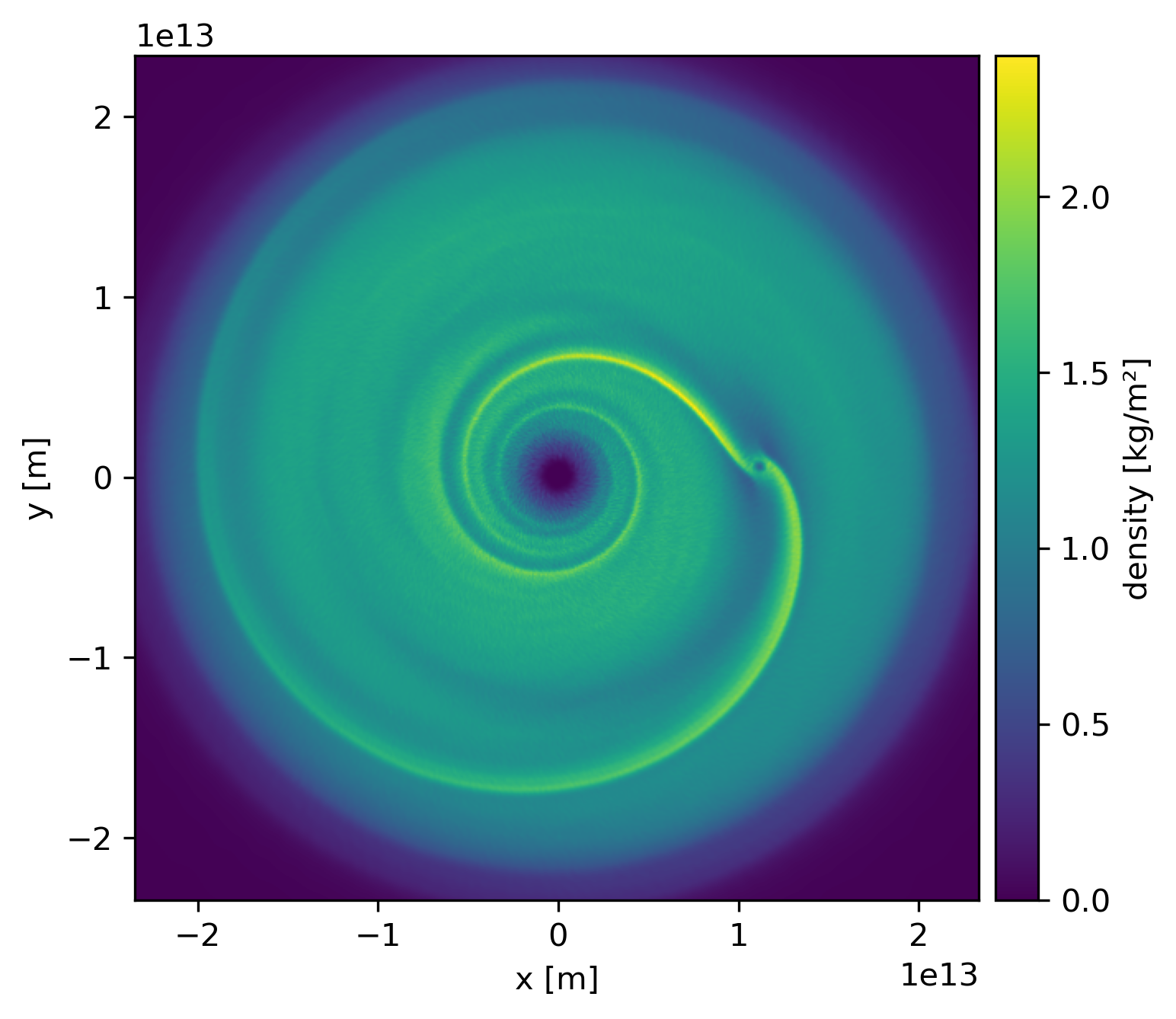
This produces an image via Matplotlib. The function returns a Matplotlib
Axes object.
Alternatively, you can pass keyword arguments to the matplotlib functions. For example, we set the units, the colormap to ‘gist_heat’ and set the colorbar minimum and maxiumum. In addition, we set the extent, i.e. the x- and y-limits.
>>> snap.set_units(position='au', density='g/cm^3', projection='cm')
>>> snap.image(
...     quantity='density',
...     extent=(20, 120, -50, 50),
...     cmap='gist_heat',
...     vmin=0.1,
...     vmax=0.2,
... )
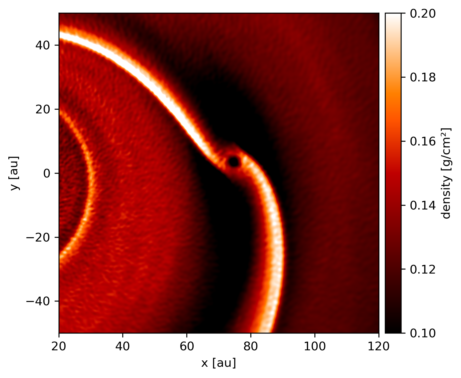
More fine-grained control can be achieved by using the full details of
image(). See the API for more details.